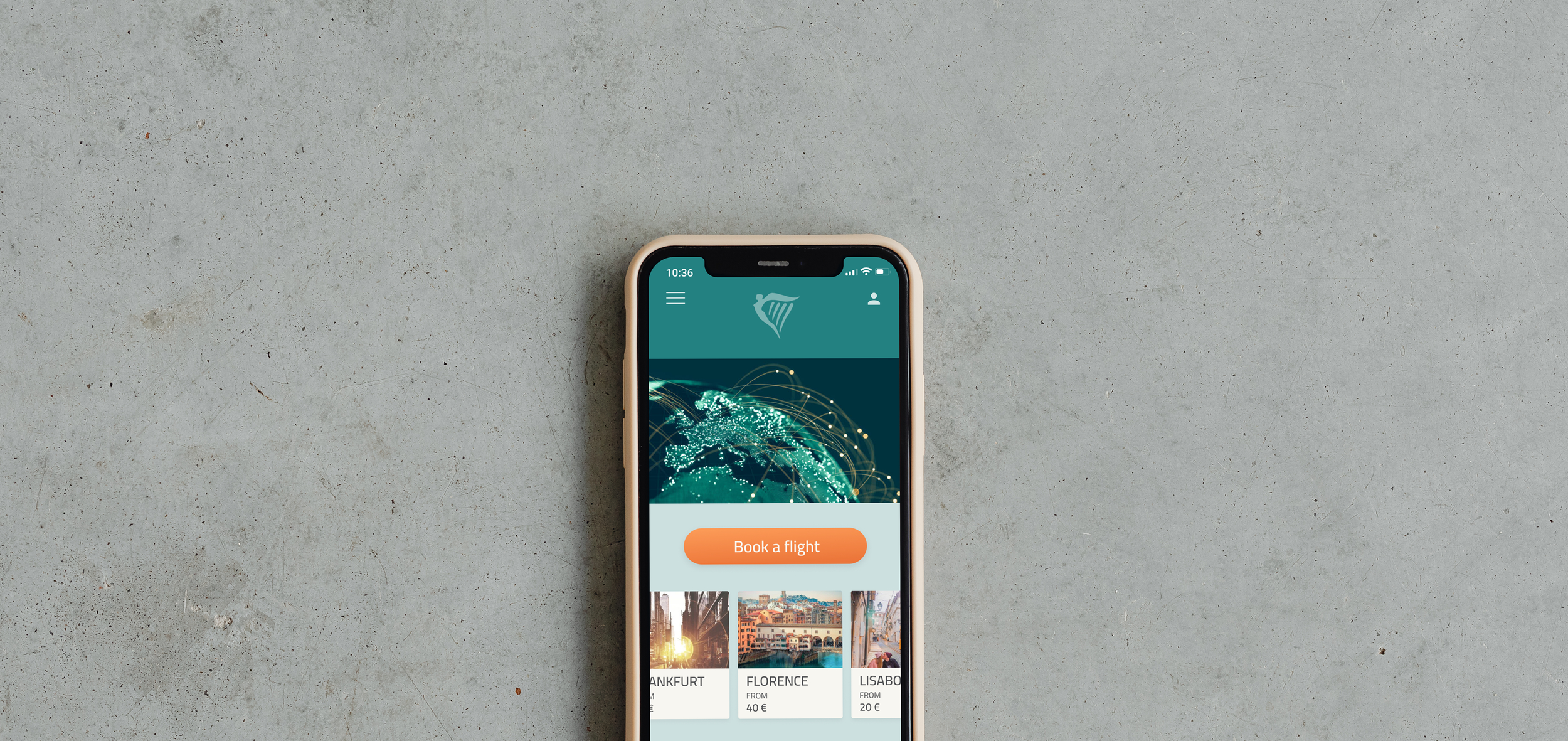
Redisigning Ryanair app
Improving the UX and the UI of the existing app
The Task
The main task of this project was to practice the UI skills at a rapid pace without the constraints of conducting user research. Started with picking an existing, well known app and improve its Information Architecture and especially the UI design. Re-branding was optional.
Note: This was a conceptual project and is unaffiliated with Ryanair.
The Problem
Ryanair is a commonly known low-cost airline operating in Europe. For a lot of people including myself the most important reason for flying with them were the cheap prises. But does it mean that as a customer I should feel cheap too while using their products? A lot of other low-cost airlines are proving this statement wrong. And in this project I’ll be proving that it also doesn’t have to be the case for Ryanair.
Project Goals:
Redesgning the UI of the 3-7 existing screens of Ryanair app after reproducing them in Figma.
Analysing and adjusting the UX design of the selected screens.
Redefining Ryanair identity.
01 - Cloning the existing screens
I started with picking 5 screens which I was about to clone in Figma. For the flow I have picked the standard first steps which every user goes through while searching for a flight: the welcome screen, home screen and the screens with searching for and picking the preferred flight.
I have soon realized that the task has deeper meaning. By cloning I could better analyse the existing design, sizes of the fields, buttons and fonts, also particular proportions and the color palette. It was a perfect warm up before I started my redesign and brought already first ideas for my UI/UX changes.
Role:
User Experience (UX) and User Interface (UI) Designer role.
Tools:
Figma, Photoshop
Time:
3 days
02 - Competitive Analysis
I have compared 5 competitors visually, among which I precisely analysed 3, also in the context of some particular UX solutions.
To sum up the competitive analysis I conclude that:
even as a budget airline you can have an interesting and well designed UI, as exemplified by the playful and energetic approach of EasyJet
Eurowings has a great example of a smart approach to the information architecture and very interesting UX solutions which make your life just easier
no airline overwhelms its customers with advertisements as much as Ryanair
The analysis have brought a lot of inspiration for improving Ryanair UI design and all the intresting UX solutions of the competitors have pushed me to look for additional ones for this redesign challenge.
03 - Moodboard and the Style Tile
I wasn’t sure from the beginning how much I wanted to intervene with the branding of Ryanair in this project, but after the competitive analysis I decided to go all the way and visibly improve the image of the company.
I went for brand attributes which would change the vibe of the company into a modern, energetic and uniting image.
Why green!?
Green/ turquoise was the color that almost immediately appeared in front of my eyes. First of all, Ryanair is Irish. Secondly, blue and yellow (the original brand colors) combined together give green which, lastly, is also the color of sustainability. Airlines are far from being sustainable, but I believe applying this color combined with some environmentally friendly actions can significantly improve the brand image.
The Style Tile
I see a style tyle as a business card of an UI. It helps to communicate the new visual language of the redesign. As for the type face, I decided for a more unique one than the current Roboto. I have picked Cairo type face, which I believe gives the design already a more modern look. I included custom-made icons, buttons and bottom navigation. To the primary color I decided to add a contrasting, energetic orange, which I planned to use as an accent in the new Ryanair UI.
04 - The Final Design
New UX Solutions
It was important to me, that despite the main task of this project, which was to improve the UI of an app, I enhance its hole experience. Therefore I’ve spent some time on designing a couple of new UX solutions, which I hope, the users would find very appealing and practical.
I added a simple cancellation button on the ,Return’ field. Thereby, the user decides for or against a return flight simply by filling in or not filling in that field.
Very important feature I added, which I have actually never encountered before, is the upper tab with the return flight. It gives the user the option to immediately switch between ,Flight from’ and the ,Flight back’.
I decided to combine two standard screens together, so that the user is immediately able to pick not only his preferred flight hour but also the flight option (basic/ standard/ plus). It shortens the process, which always makes a user happy.
The new screens
At the beginning of this project I didn’t plan to do such drastic re-branding, but I trusted the process and I believe that it resulted in some interesting final effects:
Conclusion
With this challenge I have realized how much you can change the image of a company just by redesigning its products’ UI and UX. I hope that with my solutions Ryanair has gotten not only more modern and appealing image, but also new UX approach, which will make the experience of booking a flight much quicker. If I had more time I’d for sure test my redesign with potential users and think about some more UX solutions for redesigning the remaining screens.
It was an amazing project in which we were able to show our skills, tastes, and organisation of our own work. It was so much different then working in a group. I was lacking some aspects of it, but I also appreciated the freedom, because at the end a UI can be a very subjective topic.


