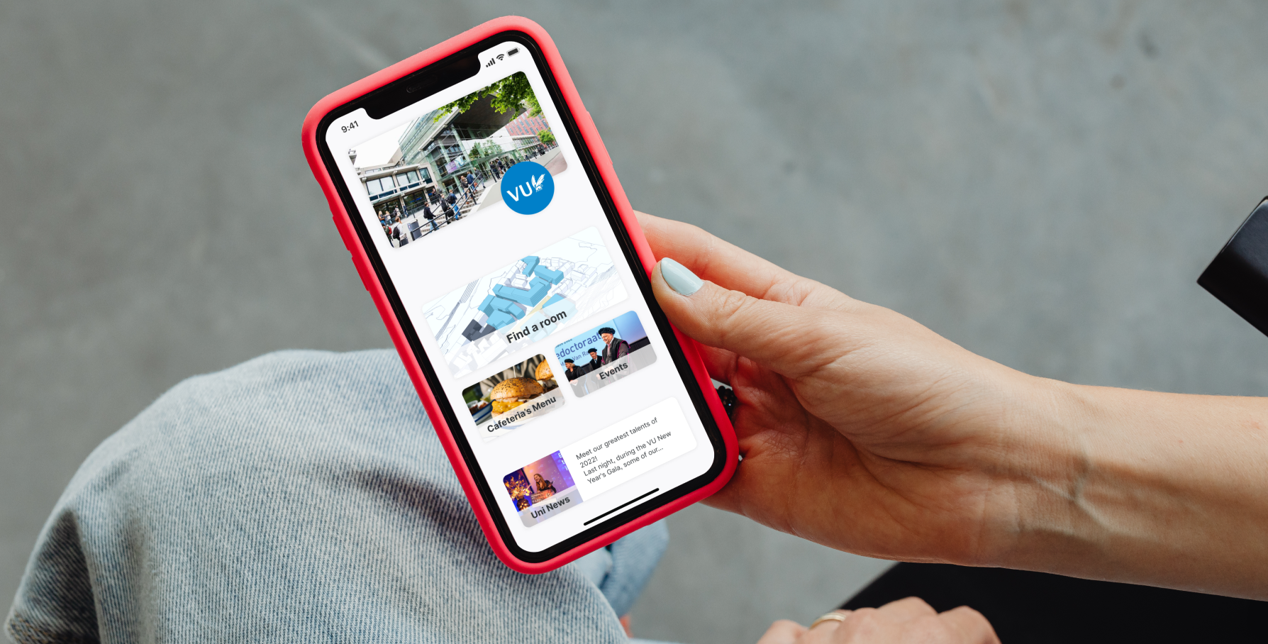
Pleq by Omnia
Redesigning an existing webapp which helps students navigate around campuses
The Task
We were asked by Omnia to redesign their existing webapp Pleq which, based on smart building technology, helps students of Vrije Universiteit Amsterdam to navigate around their campus and find a free place to study. The product is pretty new on the market, operating so far only on one university and still having limited functionality. Which gives us a great redesign potential.
Role:
User Researcher, User Experience (UX) and User Interface (UI) Designer role shared with my teammates - Lila and Diego. Led the Product Design role.
Tools:
Figma, Figjam, Photoshop, GoogleForms
Time:
9 days
What is Pleq?
Pleq is an existing webapp (available in mobile, desktop or free-standing info point version). It gathers data from sensors installed around the university and, as a webapp, doesn’t provide users with a profile. Besides, Pleq:
helps you find a free room to study
gives you information about the facilities in campus rooms
navigates you to your desired location using Google Maps outside and descriptive navigation inside the campus
helps you share your location over WhatsApp
01 - Analysing Pleq
“We’d like you to think about the customer. We expect some fresh ideas of what we can change and improve.
We want to see something new.’’
What did Omnia ask us to do?
Omnia has asked us to improve their product while taking especially the users into consideration and:
improve the UX of Pleq in general
work on the UI but leave the clean, simple design
focus on the new room-booking function
add new sections such as Events or Cafeteria’s Menu
Although Pleq operates on three different devices, in this project we were asked to focus on the mobile version.
Heuristic Analysis
The first natural step was to open the app and analyse it’s functionality and the UI. I evaluated the four main screens of the app before we started with the competitors’ analysis to find out what works and what could be changed or improved.
(-) very limited functionality of the 3D campus view
(-) confusing function and description of the blue button (what is the recommendation based on?)
(-) the navigation is only a description
(+) helpful information on available facilities
Secondary Research
There is a strong competition on the market from big players like MazeMap or MAPIQ. Being on the market for much longer then Pleq, they are offering more various and advanced features like interactive maps, personalised profiles or live navigation. But the good news is, there is constantly growing demand for smart building technologies and some of the potential opportunities include advanced AI integration to drive user engagement.
Feature Comparison Analysis
Although Pleq may be behind its competitors in terms of certain functions, there are aspects where they are standing out. For example, their technology ensures privacy since it relies on sensors, not on tracking users’ mobile devices. Another point worth mentioning are the free-standing, interactive info points, where the users can look for a room and get the navigation information by scanning QR codes.
User Research and the first problem
It was an interesting but also demanding part of our research. Having big problems reaching out to the users of Pleq, we were initially forced to interview students from different universities to check their priorities about navigating through their campuses. It was very insightful, but still not enough to check the real issues with our product. Only later on in the process we managed to contact some of the students of Vrije Universiteit Amsterdam:
Sofia:
“I’m new at the University, so sometimes I still get lost. Navigation is super important to me. Ah, and I love the Random Recommendation button! It always brings me to new places."
03 - Our User Persona and the Problem Statement
“I want to navigate through the campus and reserve rooms with ease. It’d allow me to focus on what matters most - my studies and personal growth."
Vasko:
“I know my campus very well, so I actually don’t need a map for navigation."
His frustrations
Feeling lost in navigating on the campus and getting late for his lectures
Having problems finding a free spot to study, especially before the exams
Forgetting dates of the important events at the campus
Anja:
“I wish it had more features like the cafeteria menu, events calendar, and other important information on the campus. It would be great to have everything I need in one place.”
(-) what is the function of the QR code on the mobile version?
(+) the info button provides a useful summary of the most important information on the room
So we got some contradicting answers, but it only inspired us for some interesting solutions in the redesign phase. We’ve also noticed, that some of the users’ needs were already introduced to us by the stakeholders.
(+) helpful Google Maps navigation
(-) changing the marked building on the 3D model doesn’t change the data of the building underneath
(-) confusing nav-buttons
02 - Analysing the Market and the Users
Lost Niels
Niels is a student of the 1st year of Marketing on Vrije Universiteit Amsterdam. He’s renting a small room, therefore he chooses studying on the campus, preferably with his fellow students. He’s still getting to know the campus and the university system, so there are moments when he feels lost.
His goals
Easily find a way to his classrooms and the university facilities
Quickly find and book a spot to study with his fellow students
Access information about resources, events, and activities on the campus
Plaq needs to find a way to provide better usabiliy and more features to help students like Niels easily navigate around the campus, quickly find and book a spot to study and access detailed information on the available facilities.
Our Hypothesis
If we improve the usability and navigation of the Pleq webapp and add features such as interior plans of the campus, reservation options for desks and rooms, and updates on events and resources on campus, we anticipate that more students like Niels will use the app to navigate on the campus, find and book study spaces and be updated about campus life.
Screen 1
Screen 2
Ideation
It was a great idea to discuss our ideation sketches together. It occurred that each of us had some screens designs, which really made most sense when put together with the others. We did some more brainstorming and our main flow already started to look decent. Having the essential outline we we able to commence our lo-fi’s.
Concept testing
The concept testing has brought us many insightful ideas and changes to our design. Some of the things we wanted to get rid of in the first place, like the random room recommendation button, occurred to be loved by the users. And on the other hand, our good intentions of giving users more information on a room and extending the screen appeared too confusing. But all in all we also got a lot of positive feedback and got ready to continue with our mid-fi screens.
Usability testing
The middle-fidelity wireframing process occurred to be the most intense and complicated one. It’s because we found out that in some aspects we have different views and preferences. It wasn’t easy to find an agreement at the beginning, but what has saved us was the focus on the user. We decided to put our misunderstandings aside and continue with the usability testing, to figure out which solution made most sense for our users. That approach has helped our project and actually brought us some brand new ideas and concepts.
Underneath, you can see three versions of two different screens and the comments we made after the Usability Testing.
05 - UI Design
Visual Competitive Analysis
Our stakeholders didn’t want us to change the UI design too much, because they had already built a brand around their product. So we left their typeface and color palette, but refreshed the overall look of the app and added some small elements which made it appear more modern. But before we did it we analysed the design of the competitors to check what the trends in the field are.
Our Style Tile
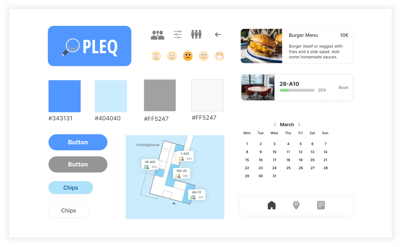
As mentioned above, in terms of the UI style we were not supposed to change a lot, but we still created a Style Tile to stay consistent while the design process.
04 - Ideation and the Iteration Process
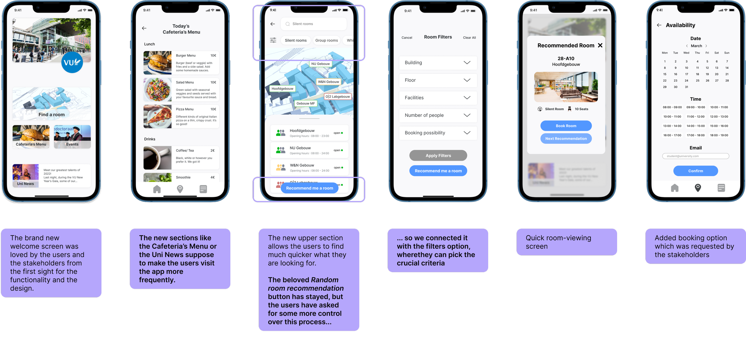
Biggest Changes
Hi-fi wireframes
Despite the lack of dramatic design changes we still added a lot of new screens and functions to the app, which were really appreciated by the users. Especially for those screens, despite sticking to the universal Style Tile, we could add some new design touches and fresh ideas. Our approach was appreciated not only by the users, but also by our stakeholders.
Next Steps
We were very happy that our redesign satisfied not only the stakeholders, but especially the users of the Pleq webapp. At the end, we redesigned for them. So it was really inspiring to see the happy faces of the users easily accomplishing the main prototype flow in the final testings.
But there was so much more we wanted to do. If not for the limited time of this project, we’d for sure work on:
Adjusting the screen designs to different devices (desktop & information kiosk)
Creating personalised profiles
Implementing an interactive map
Introducing a street view in the navigation
But for now, let us enjoy the coffee in the cafeteria, while looking for a room to study…


